In the previous blogs (basic view of clash, export clash to PDF, walkthrough API by NetCore), we can see the abilities of model coordination API.
The most important data is clash results. While it does not make sense to the end user with the raw data. In addition, not all clashes are critical. The coordination team might be concerned on some special scenarios only, e.g. if MEP components hard clash with structure/architecture elements, or any space is available for building/assembling etc. It would also cause hassle to the user with huge number of clash data. So, it turns to be a critical problem how to analyze the clash intelligently and efficiently.
It is actually a common scenario people would take some tools of analysis to check the clash, one of which is PowerBI. When I heard about PowerBI the first time, it came to my mind it just advanced dashboard. However when I dig into, I realized it means a lot. Thanks Mikako for sharing this great idea to integrate PowerBI with clash data, which allows me to learn more.
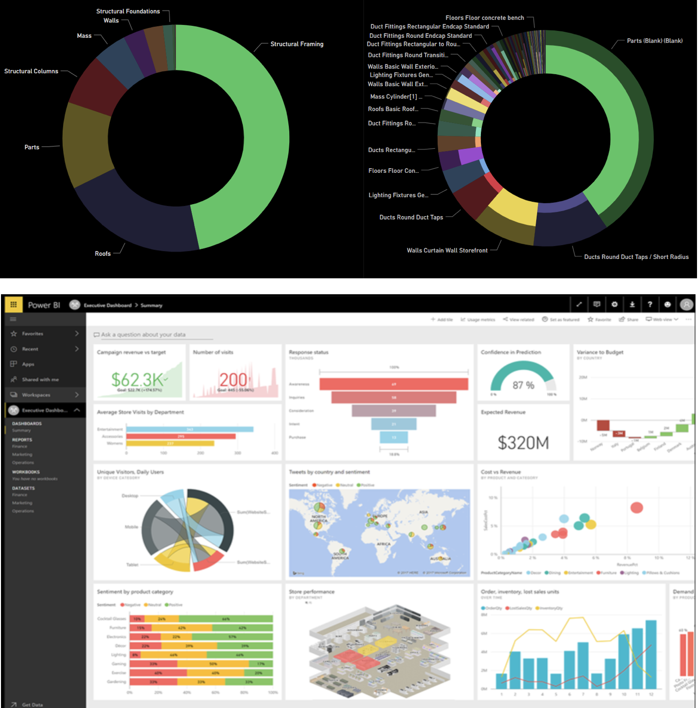
PowerBI is a cloud service platform which provides data analysis for smart applications in commercial level. It supports data source with database, data stream, IoT data, custom data(push data), or even data from scripts. PowerBI dashboards includes almost all kinds ways of visual reports, but also includes some interesting app for specific analysis, produced by the community, one of which is bubble chart we used in the integrated sample.
It is very straightforward to build the data modal in PowerBI and connect with the data. by manual, by scripting, or by APIs. Most APIs are Restful. Easy for integration. The dashboards are highly interactively, and also are linking each other smartly. e.g. with the same data source, various types of visual reports can automatically reflect the data which are clarified by one report. No coding at all. Of course, more smart features are available such as data mining, machine learning etc.
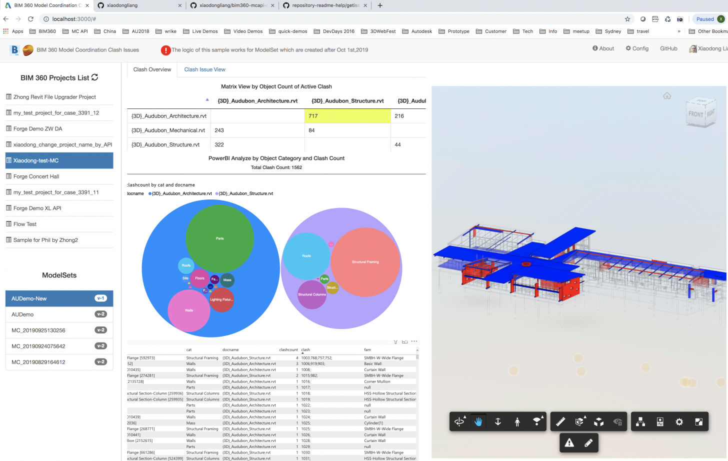
So, what is our practice with PowerBI + Model Coordination API? This is a snapshot of the sample:

The repository is available at https://github.com/Autodesk-Forge/forge-bim360-clash-powerbi. The main intension is to clarify the clash by object category, clash amount, yet between two documents of the coordination collection. We found it is very intuitive if using a bubble chart to indicate the types & clash amount in one picture. It will be also easy to check most important clash quickly.
The diagram below tells the workflow. With the raw clash data from model coordination API, the sample creates a matrix view of clash objects between documents. It is similar to grid view in BIM 360 UI. When the user clicks one pair of documents, the corresponding clash & object properties will be dumped as records. These records will be sent to PowerBI template, a data modal with bubble chart and table view, which has been created in advanced.
After the records are injected to PowerBI template, the embed container of PowerBI in web browser can be refreshed with the new records. Now it is the magic. As said, PowerBI can analyze the data automatically. The bubble chart will present the clash by types, clustered by the two documents. Click a category, all relevant clashes will be highlighted in the Forge Viewer. Since PowerBI dashboards are linked intelligently, the table view will be updated with the corresponding data which are clarified in bubble chart. The end user can check independent row of for one specific group of clashes.
Another interesting feature PowerBI provides is : Export Data view to Excel with the filtered records. No coding at all!

This is a simple practice with PowerBI. I believe you would have more insights on the more useful integrations. We’d live to hear your stories or practice with model coordination API. In the next blog, we will share some experience when working with this sample.